
A Case Study
App Uptime Monitor
Client: GapTech
GapTech needed a centralized internal application performance analytics tool that provided standardized readily-available data to leadership. While my data engineer teammates created data integrations and pipelines to efficiently precompute the metric, I ensured the user-facing tool was easy-to-navigate and reliable while displaying all the necessary data, including key trend indicators and text-based contextual descriptors.
180
hours saved monthly
$27,000
in monthly cost savings
Overview
Gap’s Information Technology (IT) leaders are responsible for keeping the company’s internal applications up and running for all of the company’s thousands of employees and stores. These tools are crucial for the company to reach its financial goals. For example, the Gap Stores IT application engineering team maintains “store applications” such as our Point of Sale (POS) systems. POS issues inhibit a store’s ability to sell to their customers and hit their quotas.
Given the importance of these applications, application owners utilize automated alerting tools and dedicated teams to quickly triage issues when they arise. IT leaders subsequently need to measure their triaging performance to ensure that they are adequately addressing outages and to give store owners confidence in their systems.
Over the years, Gap analysts on disparate teams have created inconsistent and complex metrics to track and communicate performance. This resulted in decentralized reporting of the impact and root causes of application outages across the company, and frustrated company leaders could not understand, trust, or find performance metrics.
I knew we could solve the pain points caused by legacy processes. Good design of a standardized and centralized reporting tool could alleviate distrust. Furthermore, after speaking with IT application owners, I saw an opportunity to meet an additional user need: providing root cause insights that enabled leaders to see and address underlying systems issues to prevent future outages and reassure store managers of any given system’s reliability.
After brainstorming with store managers and IT application owners, my team and I got to a clear definition of how to measure performance: “uptime” (i.e., application availability to store owners). We collected product specifications and created new data integrations and pipelines to allow us to efficiently precompute the metric. I subsequently designed the reporting product that clearly explained the “what, why, and how” of the calculation. I made the product’s information actionable by layering on explanatory metrics for our users after finding that the static nature of the “uptime” metric (i.e., it’s a simple “rating”) wasn’t enough. By providing root cause data of any out-of-the-ordinary events, the information then became actionable.
Test & Iterate
Insight #1 The singular “uptime” metric store managers and IT application owners originally wanted was not actionable in it of itself; context around the number was needed in order for the metric to be useful.
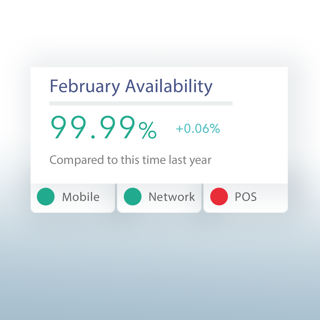
Problem: We quickly created our MVP and got it out to a test group of store managers and IT product owners to receive feedback. We found that V1 of the new reporting tool met their need for a reliable, standardized, and centralized view of “uptime”; however, we found what they actually needed was a tool that told them whether their uptime metric was good or bad in order to take action. Through our interviews with them, we found that comparing the current day metric against previous performance would enable them to judge their performance. Due to the seasonality of retail, it did not suffice to compare the current metric against the previous month’s performance, and thus we needed to provide them with the right views of the historical data rather than dumping it all in haphazardly.
Solution: Our solve was to introduce a “trend indicator” that provided a year-over-year comparison of their performance. The indicator immediately pulled out the insight of whether they were performing well or not while eliminating other historical but less useful performance data that would confuse them. Users appreciated how our product gave them context to the number on the page and made the data actionable.
Insight #2 Users distrusted the uptime metric that they were being shown as it was not nuanced enough to represent the severity of the issues they had experienced in real life.
Problem: As I tested V2 of the product with users, I still found that users fundamentally mistrusted the data. This distrust was not unwarranted. If, for example, there was a short outage that prevented store owners from selling during a peak sales season (e.g, Black Friday) but the rest of the month went smoothly, the uptime score would show a close to 100% score. To the store owners who felt the pain of the outage, it was easy to immediately write off the number as incorrect because there was no way they’d score the performance of the application at ~100%. It became clear that users needed to be able to investigate what they believed to be irregularities in order to properly judge application performance.
Solution: Because the distrust stemmed from a familiarity with the pain that outages caused, we realized that there was importance in giving store owners visual confirmation that the outages they had experienced were incorporated into each month's assessment. By including additional metrics around the quantity of outages as well as a full outage record, we created a reporting product that gained user trust. Users were reassured that our product captured their felt experiences and were being accounted for. While we had to compromise some of the visual tidiness V1 provided, we prioritized the additional information because it drove trust and thus usage.

Results
Our reporting product accomplished two goals aimed at solving problems for the (1) IT application managers and (2) Gap application users (e.g., store managers). IT application managers could now properly assess the performance of their products leading to systematic changes when needed to ensure optimal delivery of their applications to store managers. Additionally, the tool reduced the previously immense reporting time and energy load that they had to do, which allowed them to focus on actually working on their applications.
Application users could consequently trust their systems and not worry about failures that may impact their ability to hit their quotas.
Our product accomplished these goals first by turning multiple disparate and inconsistent reports into a single easy-to-navigate dashboard and second by layering on key trend indicators and text-based contextual descriptors to immediately call to attention problem areas.
This resulted in:
User base grew 8x
70% decrease in time spent analyzing uptime